St Peter’s, Rome an architectural miracle

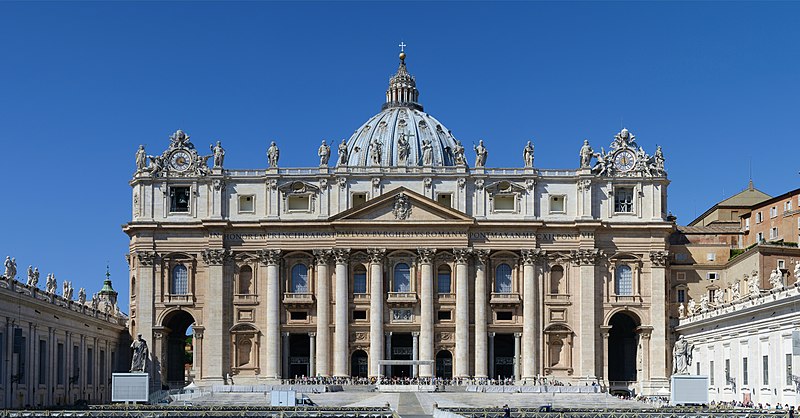
Main façade and dome of St. Peter’s Basilica, seen from St. Peter’s Square

St. Peter’s Basilica, located in Vatican City, Rome, is one of the most renowned and significant architectural landmarks in the world. Its grandeur and historical significance make it an iconic representation of Renaissance and Baroque architecture. Here is a brief discussion of the architecture of St. Peter’s Basilica:

  1. Overall Design: St. Peter’s Basilica was designed primarily by Donato Bramante, Michelangelo, Carlo Maderno, and Gian Lorenzo Bernini. It is a massive church that follows a Latin cross plan with a central nave and four smaller aisles. The basilica covers an area of 21,095 square meters (227,060 square feet) and has a capacity to accommodate over 60,000 people.
  2. Facade: The magnificent facade of St. Peter’s Basilica is characterized by its grandeur and classical design. It was completed in 1614 by Carlo Maderno. The facade features Corinthian columns, colossal statues, and intricate details. The central part of the facade is dominated by a large balcony, known as the Loggia of Benedictions, from where the Pope delivers blessings.
  3. Dome: One of the most striking features of St. Peter’s Basilica is its majestic dome, which was designed by Michelangelo. The dome rises to a height of approximately 136 meters (446 feet) and is one of the largest domes in the world. Its design combines Renaissance and Baroque elements and is considered a masterpiece of engineering. The interior of the dome is adorned with stunning mosaics depicting scenes from the Bible.
  4. Interior: The interior of St. Peter’s Basilica is vast and opulent. The central nave is flanked by marble columns and decorated with numerous statues and artworks. The main altar, called the Baldachin, was designed by Bernini and is made of bronze. The basilica houses numerous chapels, including the famous Michelangelo’s Pietà, which is located to the right of the entrance.
  5. Bernini’s Colonnade: Surrounding the square in front of St. Peter’s Basilica is Bernini’s colonnade, which consists of two curved rows of columns. The colonnade embraces visitors as they enter the square and symbolizes the welcoming arms of the Catholic Church. It is adorned with statues of saints atop the columns, creating an impressive visual effect.
  6. Vatican Grottoes: Beneath St. Peter’s Basilica, there are the Vatican Grottoes, which house the tombs of numerous popes, including Saint Peter, the first pope. The grottoes can be visited by the public and serve as a significant pilgrimage site for Catholics.

The architecture of St. Peter’s Basilica showcases the skill, creativity, and grandeur of the architects and artists involved in its construction. Its harmonious blend of Renaissance and Baroque styles, along with its monumental dome, intricate details, and vast interior, make it an awe-inspiring masterpiece and an enduring symbol of the Catholic Church.

Comparing Reynolds and Gainsborough Portraiture

Sarah Siddons as the Tragic Muse, or Mrs. Siddons as the Tragic Muse, is a 1783–1784 painting by English painter Sir Joshua Reynolds. The 1784 version is in the Huntington Library art museum, while a 1789 reproduction from Reynolds’s studio is in the Dulwich Picture Gallery.

Reynolds and Gainsborough were two prominent English portrait painters who flourished during the 18th century. While both artists were active in the same period and shared similar subject matter, their approaches to portraiture and artistic styles differed significantly. Let’s delve into a comparison of Reynolds and Gainsborough’s portraiture.

The Blue Boy (c. 1770) is a full-length portrait in oil by Thomas Gainsborough, owned by The Huntington in San Marino, California.

  1. Style and Technique:
    • Reynolds: Sir Joshua Reynolds was known for his grand, formal style of portraiture. He often portrayed his subjects in elaborate costumes and posed them in carefully composed, classical settings. Reynolds’ paintings were characterized by his mastery of capturing textures, fabrics, and details with meticulous precision. He employed a smooth, refined brushwork technique, and his portraits exuded a sense of dignity and stateliness.
    • Gainsborough: Thomas Gainsborough, on the other hand, adopted a more natural and informal approach to portraiture. His style was marked by loose brushwork, vibrant colors, and a focus on capturing the essence and character of his sitters. Gainsborough’s subjects were often depicted in landscapes or outdoor settings, which added a sense of spontaneity and liveliness to his paintings.
  2. Treatment of Subjects:
    • Reynolds: Reynolds’ portraits were often commissioned by the British aristocracy and high society, and he aimed to portray his sitters as dignified and noble figures. He employed a certain idealization in his depictions, emphasizing the virtues and elegance of his subjects. Reynolds’ use of poses, drapery, and props contributed to the construction of a narrative around the sitter, reflecting their status and achievements.
    • Gainsborough: Gainsborough’s portraits leaned more towards capturing the personality and individuality of his subjects. His approach was less formal and more intimate, allowing his sitters to appear relaxed and at ease. Gainsborough had a keen eye for capturing fleeting expressions and gestures, imbuing his portraits with a sense of spontaneity and naturalism.
  3. Influence and Legacy:
    • Reynolds: Sir Joshua Reynolds was a highly influential figure in the development of British portraiture. He established the Royal Academy of Arts in London and served as its first president. Reynolds’ emphasis on technical skill and his theories on the “Grand Style” of painting influenced many subsequent artists. His impact on the art world extended beyond portraiture, as his writings on art theory and criticism became foundational texts.
    • Gainsborough: While Gainsborough was not as influential in the academic and institutional realms as Reynolds, his contributions to portraiture were significant. His more informal and naturalistic approach had a lasting impact, paving the way for a shift in the genre towards greater informality and personal expression. Gainsborough’s focus on capturing the individuality of his subjects influenced later portrait painters, including the Impressionists.

The Age of Innocence is an oil-on-canvas painting by Sir Joshua Reynolds, created in either 1785 or 1788 and measuring 765 x 638 mm. The sitter is unknown, but possibly, was Reynolds’s great-niece, Theophila Gwatkin (who was three in 1785 and six in 1788), or Lady Anne Spencer (1773–1865), the youngest daughter of the 4th Duke of Marlborough.

Mrs. Richard Brinsley Sheridan (1787) is an oil on canvas portrait painted by Thomas Gainsborough between 1785 and 1787. It was acquired by the National Gallery of Art in 1937. Mrs. Sheridan (Elizabeth Ann Linley) was a talented musician who enjoyed professional success in Bath and London before marrying Richard Brinsley.

In conclusion, Reynolds and Gainsborough approached portraiture with distinct styles and techniques. Reynolds’ formal and dignified portrayals contrasted with Gainsborough’s naturalistic and informal approach. Both artists left a lasting legacy, with Reynolds shaping the academic traditions of British portraiture and Gainsborough influencing the development of more personal and expressive approaches to the genre. Their contributions enriched the world of portraiture and continue to inspire artists today.

Robert Rauschenburg and the iconic “Bed” painting

Robert Rauschenberg was an American artist who made significant contributions to the development of pop art and assemblage art. One of his most renowned and controversial works is his “Bed” painting, created in 1955.

Rauschenberg’s “Bed” is a mixed-media artwork that blurs the boundaries between painting and sculpture. The piece consists of an actual bed, complete with a pillow, sheets, and a blanket, which is mounted on the wall vertically. The surface of the bed is heavily worked upon, covered in layers of paint, scribbles, and various materials.

Bed, 1955, Museum of Modern Art (MoMA), New York City, NY, US

At first glance, the “Bed” appears chaotic and messy, with its worn-out and stained sheets and the aggressive brushstrokes and markings. However, the piece carries a profound conceptual and symbolic significance. Rauschenberg’s “Bed” challenges conventional notions of art, pushing the boundaries of what can be considered a painting and redefining the materials and subject matter that can be used in artistic expression.

The bed, as a readymade object, holds personal and intimate connotations. By elevating the bed to the status of an artwork, Rauschenberg blurs the line between the private and the public, turning the personal into a public statement. The use of an actual bed, with its associations of sleep, dreams, and intimate spaces, introduces a deeply personal and autobiographical element into the artwork.

The layers of paint, scribbles, and materials applied to the bed’s surface convey a sense of emotional intensity and spontaneity. Rauschenberg’s use of these elements can be seen as a response to the abstract expressionist movement that dominated the art scene at the time. By incorporating a variety of materials and techniques, Rauschenberg challenged the idea of the artist’s hand as the sole creator and disrupted the notion of a singular artistic style.

The “Bed” painting also raises questions about the nature of art and the role of the viewer. Rauschenberg’s inclusion of a real bed challenges the traditional separation between art and life, inviting the viewer to reconsider their perception of art objects and their relationship to everyday objects. The viewer is prompted to question what constitutes art, what can be considered valuable or worthy of artistic exploration, and how personal experiences and emotions can be expressed through artistic means.

Rauschenberg’s “Bed” painting generated controversy and sparked debates about the boundaries of art and the role of the artist. Some critics and viewers found the work challenging and revolutionary, appreciating its innovative approach and conceptual depth. Others criticized it for its unconventional materials and its departure from traditional artistic techniques.

Nonetheless, the “Bed” painting remains an iconic and influential artwork that pushed the boundaries of artistic expression. It exemplifies Rauschenberg’s willingness to experiment with materials, challenge artistic conventions, and explore the intersections between art and life. The work continues to inspire and provoke discussions about the nature of art, the role of the artist, and the relationship between personal experiences and creative expression.

Piet Modrian and his Philosophy of Modern Art

Tableau I, 1921, Kunstmuseum Den Haag

Piet Mondrian, a Dutch painter and one of the pioneers of abstract art, developed a distinctive philosophy on art that is often referred to as neoplasticism or the “De Stijl” movement. Mondrian’s philosophy was deeply rooted in his belief in the spiritual and transformative power of art. His ideas not only influenced his own work but also had a significant impact on the development of modern art as a whole.

Central to Mondrian’s philosophy was the idea that art should strive to achieve a universal harmony and order. He believed that through the use of abstract forms, colors, and lines, artists could express the fundamental principles of the universe and create a sense of balance and tranquility. Mondrian sought to distill the essence of reality into its purest form, removing any unnecessary elements and reducing everything to its essential geometric components.

For Mondrian, art was a means to transcend the physical world and access a higher spiritual realm. He believed that by simplifying and organizing the visual elements, artists could tap into a universal energy or truth that lay beneath the surface of appearances. He aimed to create a sense of dynamic equilibrium, where the tensions between opposing elements—such as horizontal and vertical lines, primary colors and neutrals—could be resolved.

New York City (1942), Paris, Centre Pompidou.

Mondrian’s artistic philosophy also emphasized the concept of “plasticity,” which referred to the dynamic relationship between elements within a composition. He believed that the interplay between positive and negative space, color contrasts, and the rhythmic arrangement of lines could generate a sense of movement and energy. This idea of plasticity reflected his belief in the interconnectedness and interdependence of all things.

In practice, Mondrian’s philosophy manifested in his iconic paintings featuring grids of black lines intersecting with blocks of primary colors. These compositions, often referred to as his “grid paintings” or “Compositions,” aimed to evoke a sense of harmony and equilibrium through the careful placement and balance of geometric forms. Mondrian’s use of primary colors—red, blue, and yellow—symbolized the fundamental elements of the universe, while the black lines represented the dynamic tension and structure.

Victory Boogie Woogie (1942–1944), Kunstmuseum Den Haag

Mondrian’s philosophy had a profound influence on the development of modern art and design. His ideas resonated with artists and designers who sought to break away from traditional representational forms and explore the potential of abstraction. The principles of neoplasticism and Mondrian’s emphasis on simplicity, balance, and harmony continue to inspire artists, architects, and designers to this day.

Overall, Piet Mondrian’s philosophy on art emphasized the pursuit of universal harmony, spiritual expression, and the reduction of visual elements to their essential forms. His work and ideas played a pivotal role in shaping the trajectory of modern art, and his legacy continues to be celebrated and studied by artists and art enthusiasts worldwide.

James Webb Earliest Galexies images point toward confirming my IBBU universe hypothesis

See article

https://time.com/6269232/james-webb-telescope-oldest-galaxies/

I had good news recently. The astrophysicist found 6 new galaxies, bigger than the Milky Way, just 320 million years after the Big Bang!

Now that’s awesome in its own right and The Standard Theory (Einstein) is turned on its head.

Several year ago I hypothesised a central dark body and that we see only a fraction of the universe due to this IBBU (Infinite Black Body Universe) obscuring space.

See this link: http://www.georgewombwell.com/author/2011/07/29/hypothesis-alternative-view-of-the-universe/

Copyright Getty Images (fair usage and educational purposes)

As James Webb is a million miles from Earth, it can now see more space, be it just small increase. However, if I am right we could estimate the current size of the central body. If, as I claimed, the IBBU is expanding, it might also be possible to estimate this expansion rate (or contraction rate of course).

In any event I claim this as further evidence supporting my hypothesis.

Kandinsky’s transformation to pure abstractness in his late works

Introduction: Wassily Kandinsky, a pioneer of abstract art, embarked on a remarkable artistic journey throughout his lifetime. His artistic development can be examined by contrasting his early artwork with his late works, with a specific focus on the year 1925. This period marked a pivotal moment in Kandinsky’s career, where his artistic style evolved significantly, reflecting his profound exploration of abstract expressionism and his pursuit of a spiritual connection with art. By comparing and contrasting Kandinsky’s early and late works, we can trace the trajectory of his artistic evolution and gain insights into the driving forces behind his innovative approach.

Early Artwork: Exploration of Symbolism and Impressionism In Kandinsky’s early artwork, influenced by Symbolism and Impressionism, we witness his efforts to convey emotions and subjective experiences through figurative representations. His paintings from this period often depict landscapes, cityscapes, and figurative elements, albeit with a visible emphasis on color and form.

The Blue Rider 1903

For instance, “The Blue Rider” (1903) showcases his interest in the interplay between color and mood, as vibrant blues and greens convey a sense of tranquility and introspection.

Another notable early work is “Improvisation 7” (1910), which demonstrates Kandinsky’s growing interest in abstraction. While still grounded in recognizable forms, the painting introduces fragmented shapes and bold brushstrokes that foreshadow his later departure from representational art. These early pieces exemplify Kandinsky’s inclination towards exploring color, line, and shape as tools for emotional expression, laying the groundwork for his later revolutionary works.

Late Works: Emergence of Pure Abstraction and Spiritual Connections In contrast to his early works, Kandinsky’s late works, particularly those from 1925, represent a departure from representational art towards pure abstraction. During this period, Kandinsky delved deeper into his quest for a spiritual connection with art, striving to evoke emotions directly through the interplay of colors, shapes, and forms. Works such as “Composition VIII” (1923) and “Yellow-Red-Blue” (1925) exemplify this shift.

Huile sur toile (1925) de Vassily Kandinsky. Musée National d’Art Moderne, Paris, France. Donation Nina Kandinsky 1976. AM 1976-856

In “Composition VIII,” Kandinsky creates a complex web of intersecting lines, geometric shapes, and vibrant colors. The painting eludes any literal interpretation, encouraging viewers to engage with the artwork purely on an emotional level. The arrangement of elements is purposeful, creating a sense of dynamic energy and movement, capturing the viewer’s attention and prompting a deeper contemplation of the painting’s inherent spirituality.

Similarly, in “Yellow-Red-Blue,” Kandinsky employs simple geometric shapes in bold primary colors to create a harmonious composition. The arrangement of forms suggests a cosmic order, with each shape and color interacting to evoke emotional responses and a sense of spiritual transcendence. By embracing pure abstraction, Kandinsky liberated himself from the constraints of representational art, allowing viewers to experience art beyond the confines of the physical world.

Comparisons and Contrasts: When comparing Kandinsky’s early and late works, several striking differences emerge. In his early works, Kandinsky’s focus on symbolism and impressionism reflects a more representational approach, with recognizable forms serving as a means to convey emotions. These paintings exhibit a sense of experimentation, particularly in his use of color and composition, which would later become more pronounced in his abstract works.

In contrast, Kandinsky’s late works prioritize pure abstraction, shedding any figurative elements and emphasizing the power of color, shape, and form to evoke emotions directly. His departure from representational art indicates a profound shift in his artistic philosophy, rooted in a desire to tap into expressionism through the abstract form.

Top Ten Madonna and Child artworks to see around the globe

*The choice is of course subjective, as there are many depictions of the Virgin and Child.

Madonna and child artworks have been a popular theme in Christian art throughout history, and many famous artists have created their own interpretations of this subject. Here are 10 notable Madonna and child artworks, along with their locations, sizes, and materials:

1 “The Sistine Madonna” by Raphael Location: Gemäldegalerie Alte Meister, Dresden, Germany Size: 265 cm × 196 cm (104 in × 77 in) Materials: Oil on canvas

2 “Madonna and Child with Two Angels” by Filippo Lippi Location: Uffizi Gallery, Florence, Italy Size: 92 cm × 63 cm (36 in × 25 in) Materials: Tempera on wood panel

3 “The Madonna of the Rocks” by Leonardo da Vinci Location: Louvre Museum, Paris, France Size: 199 cm × 122 cm (78 in × 48 in) Materials: Oil on wood panel

4 “Madonna with the Long Neck” by Parmigianino Location: Uffizi Gallery, Florence, Italy Size: 216 cm × 132 cm (85 in × 52 in) Materials: Oil on wood panel

5 “Madonna del Prato” by Raphael Location: Kunsthistorisches Museum, Vienna, Austria Size: 113 cm × 88 cm (44 in × 35 in) Materials: Oil on wood panel

6 “The Madonna of the Chair” by Raphael Location: Palazzo Pitti, Florence, Italy Size: 71 cm × 71 cm (28 in × 28 in) Materials: Oil on wood panel

7 “Madonna and Child with Saints” by Andrea Mantegna Location: San Zeno Basilica, Verona, Italy Size: 386 cm × 285 cm (152 in × 112 in) Materials: Tempera on canvas

8 “Madonna and Child Enthroned with Saints” by Duccio di Buoninsegna Location: Museo dell’Opera Metropolitana del Duomo, Siena, Italy Size: 450 cm × 290 cm (177 in × 114 in) Materials: Tempera on wood panel

9 “Madonna and Child” by Giotto located National Gsllery, Washington DC. Tempera on Poplar Panel, circa 1310 – 1315

painted surface: 85.4 × 61.8 cm (33 5/8 × 24 5/16 in.) overall (including added strips): 87.7 × 63.2 × 1.3 cm (34 1/2 × 24 7/8 × 1/2 in.) framed: 128.3 x 72.1 x 5.1 cm (50 1/2 x 28 3/8 x 2 in.)

10 “The Virgin and Child with Saint Anne” by Leonardo da Vinci Location: Louvre Museum, Paris, France Size: 168 cm × 130 cm (66 in × 51 in) Materials: Oil on wood panel

*All images public domain

There is a second Leonardo version “of the rocks” located at the National Gallery, London.

“The Virgin of the Rocks” (National Gallery version)
Location: The National Gallery, London, United Kingdom
Size: Approximately 189.5 cm × 120 cm (74.6 in × 47.2 in)
Materials: Oil on wood panel

The National Gallery version of “The Virgin of the Rocks” is the second rendition painted by Leonardo da Vinci. It was commissioned for the chapel of the Confraternity of the Immaculate Conception in Milan but later acquired by the National Gallery.

The above artworks represent a range of styles and periods in art history, showcasing the enduring popularity of the Madonna and child motif.

Titian: A Comparative Analysis of Titian’s Venus and Adonis “Farnese” and “Prado” Types

Introduction:
Titian’s Venus and Adonis is an iconic masterpiece that showcases the artist’s unrivaled ability to capture the complexities of human emotion and the sublime beauty of the human form. The painting, created during the Italian Renaissance, has been revered for centuries for its exceptional composition, use of color, and narrative power. Two renowned versions of this painting exist, one housed at the Farnese Gallery in Rome (probably a lost version and there are 30 versions overall) and the other at the Prado Museum in Madrid. This essay will explore the similarities and differences between these two versions, shedding light on the distinct artistic choices made by Titian and the impact they have on our interpretation of the narrative.

Top – Farnese type Bottom: Prado type

  1. Composition and Scale: The Farnese version of Venus and Adonis presents a horizontal composition, with the figures arranged in a linear manner across the canvas. Venus, the goddess of love, occupies the left side, reclining sensuously on a bed of sumptuous fabrics. Adonis, the handsome mortal lover, stands on the right, dressed in hunting attire. The Prado version, on the other hand, adopts a more vertical composition. Venus and Adonis are brought closer together, emphasizing their physical proximity and emotional connection. This altered composition creates a more intimate atmosphere in the Prado version.
  2. Color Palette and Brushwork: Titian’s skillful use of color is evident in both versions of the painting. In the Farnese version, the color scheme leans towards warmer tones, with rich reds, golden yellows, and lush greens dominating the landscape. The colors evoke a sense of passion and vitality, reflecting the intense emotions associated with love and desire. In contrast, the Prado version exhibits a cooler palette, with a greater emphasis on blues and silvery hues. This cooler color scheme lends a more melancholic and contemplative mood to the scene, capturing the impending tragedy of Adonis’s fate.
  3. Emotional Expression and Narrative Depiction: One notable difference between the two versions lies in the portrayal of the characters’ emotions. In the Farnese Venus and Adonis, Venus’s face exudes a sense of longing, her eyes fixed on Adonis with a mix of desire and concern. Adonis, however, appears more detached, focusing his attention on his hunting dogs. This contrast highlights the tension between their respective desires and foreshadows the tragic outcome of their story. In the Prado version, both Venus and Adonis display heightened emotional intensity. Venus’s expression is anguished, her hand reaching out to prevent Adonis’s departure. Adonis, in turn, conveys a mixture of hesitation, resolve, and sorrow, enhancing the dramatic impact of the impending separation.
  4. Symbolism and Surrounding Elements: The surrounding elements in the two versions contribute to the narrative and symbolic context of the painting. In the Farnese version, a group of playful cupids hovers above Venus and Adonis, symbolizing the divine intervention that will ultimately lead to Adonis’s demise. Additionally, a landscape with a distant cityscape suggests the temporal nature of mortal existence. In the Prado version, the landscape is simplified, focusing attention on the emotional connection between the two figures. The absence of the cupids in the Prado version enhances the sense of impending tragedy, stripping away the divine intervention that offers a glimmer of hope in the Farnese version.

Conclusion: Both the Farnese and Prado versions of Titian’s Venus and Adonis are exceptional examples of the artist’s mastery in capturing the essence of human emotion and beauty. While the two paintings depict the same narrative, their differences in composition, color palette, emotional expression, and surrounding elements contribute to distinct interpretations and emotional impacts